Research was one of the most important parts of the creation of the video as this inspired our ideas and allowed us to know of the conventions. To do this, we used many new media technologies to do this. Google was an important initial tool as it allowed us to search for websites which would inform us of the music video industry and the conventions of music videos. For example, I first used Google to search for the writings on music videos by Shuker, which then allowed me to find out more about the topic. Another tool useful for finding and viewing example music videos was YouTube. We used this to find videos from artists which we analysed on Blogger. Another important research technology we used was our college's Modular Object-Oriented Dynamic Learning Environment (MOODLE). This allowed us to access all the course specific documents which our college had access to including writings by Shuker.
The main new technology was an MP3 streaming website called totallyunsigned.co.uk. This allowed us to find artists who unsigned and had no copyright. We could then take a sample of songs to decide which song we should use and download it legally and for free. Without this technology, we would likely never have found Anna Neale's song. To filter our search, we looked for artists classed under pop/rock and listened to artists whose name and image would be suitable to make a music video around.
Constructing the video, we made use of DV cameras which allowed us to create a video with high quality visuals and allowed us control over white balance and aspect ratio. We also used high powered lights to film some parts of the video to keep the scene well lit. Editing the video, we used the technology of Adobe Premier Pro 5. This allowed us to paste together the parts of the videos we wanted far easier than other technologies such as Windows Movie Maker or QuickTime Pro. We did however have some problems with the software as one of our filming shoots was filmed in MPG instead of AVI. This caused problems with the program causing it to not respond at intervals and delaying our work by around five hours. YouTube was also used to distribute our product. This allowed us to distribute our music video all over the free world and reach a very large audience. It has also allowed us to receive feedback from people who have watched it including the artist herself.
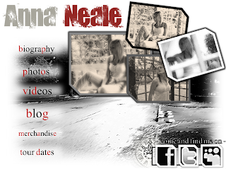
When creating the website, the two main technologies we used were PowerPoint and Dreamweaver. The layout for the main homepage was created using the imaging tools present on the 2010 version of PowerPoint and allowed a high quality visual product to be created. We then imported the image onto Dreamweaver and added hot points to it. We then hyperlinked the hot points to other documents and appropriate websites. To allow the video to play on the website, we converted the video to FLV on Adobe Premier Pro. We could then use the built in FLV player on Dreamweaver to play the video on the HTML.
The digipack was created on Fireworks and was created using photos taken at our video shoots. We made use of the greyscale and sepia effects on the programme and created pictures appropriate to a digipack. We also included a track listing on the back.
Blogger was an important tool in writing this evaluation as it allowed me to retrospectively view everything I had done so far in this project. It allowed me to order my work chronologically and easily as well as reflect on what I had achieved so far.
Music Video
16 December 2010
What have you learned from your audience feedback?
We received feedback on our video in two different ways after the completion of our project. The first was personal feedback which was given after our video was exhibited in front of an audience. The second was from comments posted on our YouTube upload of the video.
After our exhibition of our video in front of an audience, we asked the audience about what they liked about the video and what they didn't like. We got a significantly higher amount of positive feedback than negative feedback. Praise by many people was given to the lip synching, Sophie's high performance, the timing we used in our editing, the shots against the wall, the use of greyscale, and the fact that many of them would consider viewing the video again for enjoyment. The things which came up which we needed to improve were the white noise used during the beginning and the visual problems during the argument shot. The white noise we use in the video is intended to fill the sound void for the parts at the beginning of the video where the song has not begun yet. However, many people have said it was just "wrong" for the video with one person saying that it resembled a "vacuum cleaner" which ruined the atmosphere of the beginning. We managed to fix this in the update by using a different variety of white noise. During the argument shot there were several visual problems. The first is that the actors are stationary at the beginning of the shot as they are waiting for the scene to start. The second is that there is a visual glitch during the zoom sequence. The final problem is that at the end of the shot, you can briefly see Sophie come out of character and smile. It was said that these mistakes were easily noticeable and makes the video look unprofessional. We fixed the first and the third of these problems in the update by shortening the shot, but we could not find a way to fix the glitch in it without disrupting the zoom in the shot and making it appear fragmented. After the feedback session we all agreed that this feedback was correct improved what we could.
As of writing this evaluation, we have had five comments on the video.
annaneale: Love it guys, fab x.
AthenaSky093: Love the video, very authentic and realistic. Good use of lighting and really impressive camera angles.
Sockett123: <3 Love it
donandgerlinde: Wow factor is huge!!!! Great visual story, amazing lip synch. Loved it!!!
SophieSockett01: Omg Love this video :)
All the comments on the video are similar to the comments received from the viewing. One comment we were very satisfied with was the comment from annaneale as we found out that this YouTube account actually belongs to the artist who wrote the song. We knew that as the artist herself was pleased with the video, we must have done well.
We individually showed different people our designs for the digipack and collected Reponses. Positively, a majority commented on how the images appeared very unique and looked very professional. Negatively, quite a few people thought that it was inappropriate to have the images in greyscale as they believed it would be difficult for people to notice it in a large collection of CDs. We discussed this feedback but decided that we could not address this issue without making the style inconsistent. We knew that this was something heavily avoided in real and successful media products, so we decided we had to leave it as it was.
We also individually asked people for their feedback on the website. Many people commented that the main section of the home page looked very stylistic and professional which was something we had specifically aimed for. However, they did not like the section with the video at the bottom of it as they believed that it did not conform to the rest of the web page. We attempted to fix this, but as none of us have sufficient experience using Dreamweaver, we could not do it.


How effective is the combination of your main product and ancillary texts?
In our website and digipack creation, we made sure that we followed the proper conventions for ancillary texts for a media product. The main aim of our website in the context of a real media product would be to sell the music of our artist. To do this, we included a version of the music video on the website and links to the websites Amazon and I-Tunes which would allow a user to buy the music. We also included links to a biography, tour dates, her blog, her photos, her biography, merchandise, and her other videos as well as links to her accounts on Facebook, Twitter and My Space. We included these because we have observed real artist's websites and decided to include these as they appear conventional. We observed that these links would be used in a website to try and get the user to feel a personal connection between them and the artist, therefore wanting to buy the music of the artist. To make the pictures on the homepage more interesting to look at, we stylised them to look as though they were photos from a photo album.
The main aim of our digipack in the context of a real life media product would be to look appealing enough for a potential customer to buy. This is why we tried to make our digipack stand out as much as possible while at the same time, try to keep a similar atmosphere in the digipack as it has in the video. A problem which this posed was that the video was filmed in greyscale. This meant that to avoid it clashing stylistically, we had to make the digipack cover in greyscale. We tried to make it stand out with the unusual images on the front and back. We hoped that this would catch an audience's attention enough for them to curious about album so that they might buy it.
We tried to establish our fictional artist with a particular style to try and get an audience to associate the style with all things created by her.
In what ways does your media product use, develop or challenge forms and conventions of real media products?
There are many forms and conventions of real media products which we have made sure we included in our video. The first we have used is editing which conforms to the timings of the song and keeps with the pace of it. We knew this was essential as we had seen previous examples of videos which did not use this and realised how it negatively contributed to the atmosphere of the video. This is why in our video we do not cut during lines in the lyrics of the song and usually try to cut inbetween them, giving the video a structure of four different shots for each verse. During the slower parts of the song, we also chose to increase the shot lengths to keep with the pace of the song. This was seen in the mid-section of the song 'The Memory Remains' which I spoke about earlier in my blog, as it has one thirteen second shot compared to usual shot lengths of around half a second.
Another form we used was effective white balancing. During all the filming sessions, we were regularly checking the white balance to make sure it was equal on all shots. During one filming session, we had a persistent problem with white balance due to changing light conditions, which meant we had to discard all of the shots.
One more form we included was ensuring that audiences would enjoy repeated viewings of the video. To do this, we picked our song carefully from a large pool of songs. We eventually chose one which we believed was the most enjoyable to listen to repeatedly, and had the most potential to become a music video. After that, we just had to make sure that there was nothing in our music video which might spoil viewer’s enjoyment.
We also made sure to include various themes in our video that are present in real media products. One theme we used which is popular in music videos is Voyeurism. This is done near the beginning of the video when the camera zooms into a window where the two people are arguing. This theme however is not used extensively in our video as that is not a theme we want associated with our video. Another theme we use is sex appeal. This is done widely in the video when the protagonist is singing in her red corset. According to Shuker this is used widely to appeal to people, mainly men, but also as a model for women to base their looks on.
26 November 2010
Final Touches
Today, we finally finished editing the video, and played it through checking for errors. We then exprted it to AVI and started uploading it to YouTube. We then made quick and final changes to the digipack and the website.
24 November 2010
Solution
To help fix the problem, our faculty manager bought in a technician to attempt to convert the files. He believed he had solved it by using a converter which would turn the MPEGs into AVIs. He however had failed as the new files would not work in Adobe Premier Pro and were in a different aspect ratio. I managed to solve the problem by converting and exporting the MPEGs into AVI in Adobe Premier Pro one-by-one.
22 November 2010
Technology problems
Today we had severe problems editing the video as we had problems with the adobe software. Tom and Sophie were absent and the software repeatedly didn't respond for long periods of time. Our best attempt at fixing the problem was converting the MPEG files into AVI files.This failed however as everytime we tried to load the files into the program the program crashed. We were unsure how to progress.
12 November 2010
Editing
After doing some filming on tuesday, we decided it would be easiest to restart the editing as we have gaps in our editing timeline which will be very time-consuming to fill without corrupting the rest of it.
9 November 2010
Third Filming Session
Today was our third filming session. The majority of filming in this session was done by Tom and Andy. This was the first session where we had and needed additional lighting. This meant that I was in charge mainly of operation and placement of the lights.
Mannequin (Lying Down):
Mannequin (Lying Down):
8 November 2010
Website improvements
We decided that a good way to improve the visual image of the website was to create it in powerpoint, then import it in images into DreamWeaver. Andrew created a quick draft on powerpoint to test. I then pasted it into paint, then split it into seperate images, then copied them one by one into Dreamweaver. I then added hyperlinks to some of the images to act as links. However, I came across the problem that whenever I previewed it, there was a purple or blue border around it which indicated it was a hyperlink. I then got help from a fellow student who showed me how to fix the problem by changing the number in the border section of 'properties' to 0.
This shows that it can be done and we are now creating a more stylish version on powerpoint.
5 November 2010
22 October 2010
Digipack
I aided Andrew, Tom and Sophie in the further design of the digipack. We agreed on this design for our front cover.
This was an idea to either use in the digipack or the website.
19 October 2010
Second Filming Session
Today, we returned to Suffolk Lodge to film more sequences for the video. This time we were using streets near and around Suffolk Lodge and using the house as a base to store equipment and charge the camera halfway through filming.
Wall Shots:
Wall Shots:
This filming was done in a small neighbourhood near Sulfolk lodge. We used the wall for various shots using slight variation in costumes. We filmed the chorus and second verse on this section of Filming. This was filmed mainly by me and Tom where we did midshots of her in front of the wall and close ups of her face at each side of the wall.
Walking Shots:
This involved Sophie walking down the street in her red corset while I filmed her singing the chorus. This took a few takes as we had to make sure Sophie's and myself's speeds were equal. As this was a handheld shot, I also had to make sure that it was not too shaky.
Final Shots:
We filmed the final shots of Sophie from across the road. This involved Sophie walking towards the camera, singing the final chorus and throwing her corset away to represent her change in personality and her loss of insecurities. This filming was done mainly by Tom who I assisted in the positioning of camera.
15 October 2010
Filming delay
We planned to film today on the 15th of October. However, there was a burst water pipe in the area which closed the school/college which meant that we could not collect the equipment to film with.
http://www.thisisnottingham.co.uk/news/1-200-homes-water-electricity-pipe-bursts-Stapleford/article-2763129-detail/article.html
http://www.thisisnottingham.co.uk/news/1-200-homes-water-electricity-pipe-bursts-Stapleford/article-2763129-detail/article.html
12 October 2010
First Filming Session
In our first filming session, we filmed at a place called Suffolk Lodge in Beeston. We began by putting the camera on charge, preparing the settings on the camera and having a look around the location. We then began taking various photos of the location and of Sophie.
Location Shots:
After the camera was charged, we started filming some location shots. We began with some pan shots of the house which Tom and I filmed. This also included a close up of the sign which said 'Suffolk lodge'. Sophie and Tom then went to rehearse the argument which we were going to film. In the meantime, Andrew and I filmed various shots of the garden. I filmed shots of the bench which we would use later, a 360 shot of the garden and a shot of the birdhouse.
Arguement Scene:
When Sophie and Tom were ready, I got a coffee table from inside the house to balance the tripod on because the tripod could not go as high as we needed it to. I practised steady zooming to make the shot look proffessional and steady. When we started filming, it took a few times as there was the issue of Tom or Sophie unintentionally ducking out of the frame prematurely. Eventually, we managed to get one good shot of it.
Bench Scene:
We filmed a scene on a bench where Sophie would sing the first part of the first verse. The first shot I filmed was a shot of an empty bench where she walks over and sits on it. I then filmed her singing the first verse in long shot before we repeated the verse in close-up and midshot from a new angle.
Corset and Cage Scene:
Sophie then changed into her Red Corset to do the next part of the filming. This is supposed to represent a change in Sophie's character. We filmed a few different shots of Sophie dancing in the cage while singing the first pre-chorus and the chorus.
11 October 2010
Digipack and Website
We began work on the digipack and website today where we all made seperate contributions. To begin, I created a template on Paintshop Pro to outline how I believed the photos should be divided. However, I realised soon that Paintshop Pro could not import or combine images, which would make it difficult to work with later. This motivated me to create the digipack section in Paint, as it's interface is better.
Afterwards, I began to experiment on Dreamweaver to try and learn how to create a website. After a long while, I understood its important features such as "CSS types" and created a basic version of what the website might look like.
4 October 2010
Questionnaire
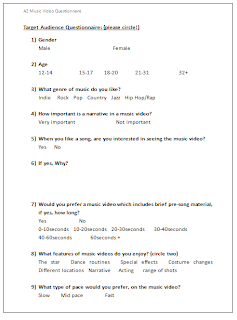
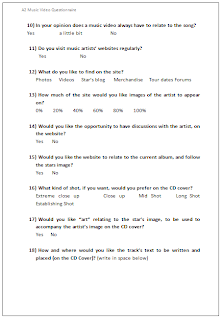
27 September 2010
Needed Props
Mannequin - This may be used several times.Sophie in one of the beginning shots will lie on top of the mannequin and then roll off it, revealing it. In another sequance, Sophie will move mannequns in such a way to shape what she wants in a relationship. Mannequins suit the song's theme and genre which is why we chose this for our song.

Microphone - Sophie will sing into it for certain aspects of this video.
Motorbike - We may film a scene with dark Sophie posing on a motorbike. 
23 September 2010
Not Made For This-Anna Neale Lyrics
Go down, into yourself and find those holes.
Because you, are so perfectly wrong.
Listen to me and I'll tell you what you want.
Get your life sorted out, go get a proper job.
Here goes another night, I sit and hold on tight.
Listening to my half circle preach.
Can never get it right, they stay or leave in fright.
Maybe i'm just not made for this.
Cause I'm not designed for this,
I wasn't made for this.
I'm not designed for this,
for being so twisted, yeah.
Look at me, and see what you can achieve.
We f***ed up, but doubt your insecurities.
Money is power, and I have everything.
But I think you forgot the meaning of happy.
I need a break from this, cause I just can't process it.
It wasn't like this from the start.
Can never get it right, they think i'm dull or bright.
Maybe i'm just not made for this.
Cause I'm not designed for this,
I wasn't made for this. No i'm not, cause I'm not, no I'm not.
Because I'm not designed for this,
for being so twisted.
Because I'm not designed for this,
I wasn't made for this
Yeah
Risk Assessment
Getting Injured By Moving Car:
We will ensure that precautions are put in to place for road safety during footage around roads and we will never film actors crossing busy roads. (If crossing of a road is necessary in one shot, then the cameraman will never rush actor and make sure he/she feels safe crossing the road and that they do it as naturally and safely as possible).
Getting Lost:
During certain scenes, we will make sure that all actors have phone in their pocket in their pocket if they cannot find way back. However, this will be prevented by filming in groups of three or four at all times, which will limit individual isolation.
Damage to Equipment:
We will make sure, when handling equipment, that we do so gently and slowly, preventing any quick slips, trips or falls with the equipment. We will also share the equipment when walking therefore preventing any one person to carry all of it by themselves, which will hopefully prevent injury or damage to person or equipment.
Strangers/Assault:
We will make sure as a group that we don't annoy or aggravate members of the public during the filming's of our scenes. We will choose fairly isolated areas during the day to avoid this, but if we encounter a person we will take extra safety precautions to avoid awkward questioning or negative vibes.
General Injury:
We will ensure that our locations are near college during, college hours, so if something happened we can quickly return to get help. Also we will always travel in a group of 4, therefore if someone is in trouble, one (or two) member(s) of the group can stay with them whilst the other one or two can run off for help.
Illness:
If a member of a group falls ill time needs to be used efficiently to remain on schedule. If its more than 2hrs we need to find replacement or a definite reschedule date will be set and be met without exception.
21 September 2010
Subscribe to:
Comments (Atom)


